

Color Box Manufacturer Insights for Custom Packaging Solutions
2026-09-27
Your custom packaging does more than hold a product—it sets the first physical impression your customer will ever have. Yet most brands overlook the small production decisions that separate a forgettable box from an unboxing moment people share. Drawing on practical color box manufacturer insights, this guide breaks down how substrate choice, print finishing, and structural design work together. At Kuaijie Carton, these details aren't treated as afterthoughts; they're built into every sampling and production run. Here’s what to watch before you approve your next packaging spec.
What Your Color Box Supplier Won't Tell You About Ink Coverage
Ink coverage isn't just a technical spec—it's the quiet driver of your final cost and lead time. A design that looks rich on screen might demand 300% ink laydown, which means longer drying, more passes, and a higher chance of set-off between sheets. Most suppliers won't volunteer that your deep black background could trigger an upcharge until the quote lands on your desk.
Then there's the creasing problem. Heavy solids along fold lines often crack or flake once the box is assembled, especially on uncoated stock. Your supplier may suggest a lamination or UV coating to mask the issue, but that's another hidden line item. Ask for a printed proof on the actual substrate before you commit—it's the only way to see how coverage behaves under real folding stress.
If you're printing large areas of a single dark color, consider reducing coverage to 240% or less by swapping CMYK mixes for a spot color. It cuts drying time and gives you cleaner edges. Just don't expect your supplier to bring this up; they'd rather quote the job as-is than redesign your file.
Choosing Board Stock That Survives Shipping Without Bulk
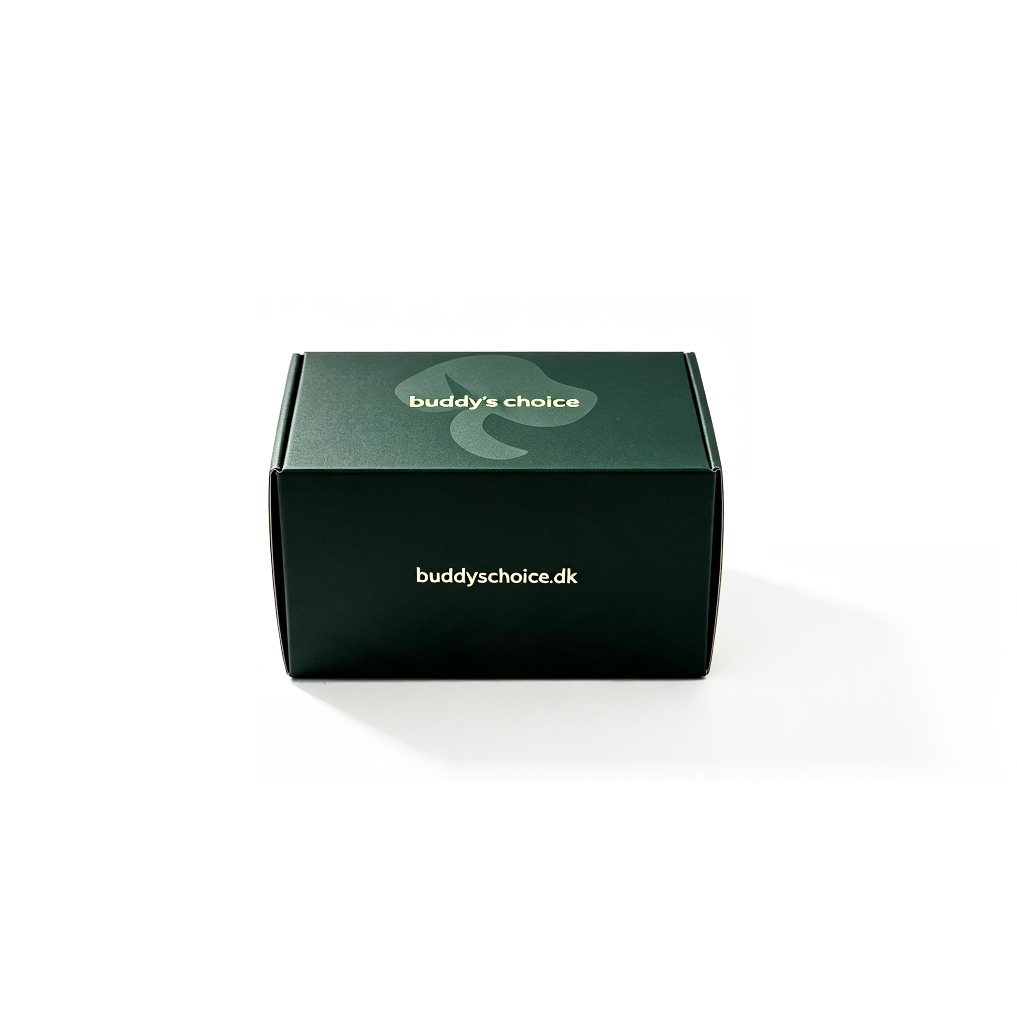
Caliper alone is a weak predictor of shipping survival. Two boards can read 18 pt and behave completely differently depending on fiber furnish, density, and how the sheet was formed. Look beyond the spec sheet: a dense, well-bonded SBS with balanced ply construction often shrugs off corner crush and edge impact better than a thicker but spongier recycled sheet.
If you're mailing flat or folded pieces, micro-flute and E-flute can add rigidity without pushing you into a higher freight class the way B- or C-flute will. A 100–120 gsm liner over an E-flute core keeps the total profile slim but protects surface graphics from scuffing and bending.
Score depth and grain direction are the quiet failure points. Even the right board will crack or fold weakly if scores are cut too deep on the wrong axis. Test a folded dummy with the exact finishing setup before committing to a full run, and if the item has to survive automated sortation, add a small drop test rather than relying on supplier data.
Why Matte Lamination Often Beats Gloss for Premium Brands
Run a fingertip across a matte laminated card and you'll notice it immediately: the surface feels soft, almost fabric-like, with none of the tacky drag that gloss produces. For premium brands, touch is often the first handshake with a customer, and a matte finish communicates restraint and care before a single word is read. Gloss, by comparison, can feel slick and overly polished in a way that reads as trying too hard.
Light behaves differently on matte. Gloss bounces light back, creating bright spots that hide details and make text harder to read under store lighting or in photos. Matte scatters light, so a label or business card stays legible from nearly any angle. This also matters for product photography: matte surfaces rarely need the same level of glare correction, saving time and keeping the final image closer to what the eye actually sees.
There's also a cultural association at play. Gloss is everywhere—on candy wrappers, magazine covers, budget electronics. Matte feels less common, more deliberate. That scarcity of shine signals a brand that doesn't need to shout. A dark matte box or a soft-touch brochure suggests confidence, while a glossy one can tip into looking like it belongs on a clearance shelf. Of course, gloss still has its place when you want energy and pop, but for quieter, higher-end positioning, matte usually wins by saying less.
The Hidden Cost of Ignoring Structural Design Early
When a system's underlying structure is decided on the fly, every new feature becomes a negotiation with the existing shape. Teams end up writing adapter code, clever hacks, and workarounds that quietly inflate the codebase. The real cost isn't in the first implementation—it's in the weeks spent later untangling assumptions that were never questioned.
Data models and interfaces are especially unforgiving. Once a flawed schema or a poorly thought-out endpoint is in production, it gains inertia. Changing it means coordinating across frontend, backend, and possibly external consumers. The hidden expense surfaces as endless meetings, duplicated validation logic, and brittle tests that nobody fully trusts anymore.
Skipping structural design early often looks like saving time, but the ledger rarely balances. A few hours spent mapping relationships and failure modes can prevent months of reactive debugging. The teams that thrive aren't the ones that move fastest initially—they're the ones that don't have to rebuild the foundation while the building is already occupied.
Making Sustainability Claims That Hold Up Under Scrutiny
A claim that survives outside scrutiny rarely leans on words like “eco-friendly” or “green” alone. Those labels dissolve the moment a regulator, journalist, or sharp-eyed customer asks for the underlying numbers. Instead, a durable sustainability claim points to a measurable shift: a 34% drop in water use per unit since 2021, a switch to 80% post-consumer recycled aluminium, or a carbon footprint verified against the GHG Protocol. It also names the method behind the figure. When you attach the specific standard, the third-party auditor, and the exact boundary of what was measured, the claim stops being a slogan and starts behaving like a data point.
Transparency does more than defend a claim; it often becomes the claim itself. Publishing the full life-cycle assessment, including the uncomfortable parts—transport emissions, end-of-life waste, or water treatment failures—reads as confidence rather than weakness. Companies that hide behind a single cherry-picked metric invite suspicion. The ones that open their supplier records, show the raw material traceability, and invite unannounced audits tend to attract fewer challenges, even when their numbers are imperfect. Scrutiny rewards those who treat sustainability as an ongoing investigation, not a finished badge.
Finally, a claim that holds up is one that can change without collapsing. New data may reveal that a bioplastic uses more energy than anticipated, or that a “recyclable” package lacks real recycling infrastructure. The strongest companies update their public statements, explain what they got wrong, and adjust the target. That kind of course correction rarely makes headlines, but it builds the sort of credibility that survives the next wave of questioning. In the end, the goal is not to sound certain; it is to be answerable.
Questions to Ask Before Signing Off on a Custom Box Order
Before you approve the final artwork, ask whether the dieline has been tested against the actual product—not just a digital mockup. A box that fits a prototype on screen can crush corners or leave too much void once the real item drops in. Confirm that the corrugated flute direction, caliper, and insert design have been verified with a physical sample, not just a PDF.
You should also dig into the finishing details that affect how the box feels in hand. Are the coatings—matte, gloss, soft-touch, or UV spot—compatible with the print coverage and the glue points? Will the varnish crack at the fold lines? Ask for a strike-off or a finished sample under the exact lighting where your customers will see it. A subtle change in texture can make the unboxing feel premium or cheap.
Finally, pin down the supply chain commitments. What happens if the mill runs short of the specified paperboard, or the printer’s die wears down mid-run? Request a written contingency for material substitutions and a defined tolerance for color drift. More importantly, ask who owns the plates and cutting dies if you switch vendors later—paying for them upfront doesn’t always mean you can take them with you.
FAQ
Beyond just equipment lists, pay attention to how they handle color matching across different paper stocks. A manufacturer that understands ink absorption on kraft versus coated board will save you from washed-out graphics later.
The box shape sets the foundation. Rounded corners, tuck-end flaps, or a rigid two-piece setup can change how light hits the printed surface, so it's worth prototyping before committing to a large run.
Screen colors are backlit and use RGB, while print relies on CMYK inks. If the manufacturer doesn't adjust for dot gain and paper brightness, the finished box can lose saturation. Ask for a wet proof on the actual stock.
Aqueous coating adds a light scuff guard, while UV coating gives more gloss and resistance. For boxes that slide against each other during shipping, a soft-touch laminate can prevent marks and keep colors cleaner.
Insist on a physical color standard, not just a digital file. Store the approved sample with the manufacturer and ask them to check each batch against it under controlled lighting. Small shifts in ink viscosity or press temperature can drift over time.
Yes, focus on one or two finishing details. A subtle emboss on the logo or a colored interior instead of plain white can create a high-end feel without driving the per-unit cost through the roof.
They often underestimate the importance of die-cut accuracy. A box that's off by a millimeter may not fold cleanly, so ask for a physical sample before approving the full production run.
Recycled boards tend to have more flecks and a darker base, which can mute bright colors compared to virgin fiber. If you want vivid branding, consider a brighter white recycled stock or adjust the design with stronger ink coverage.
Conclusion
Most buyers assume a color box's print quality comes down to the design file, but experienced manufacturers know ink coverage is a negotiation between the artwork and the board. Heavy solids can warp lightweight stock, while under-specified coverage leaves colors looking washed out on recycled substrates. The real trick is matching board caliper and fiber direction to your shipping method — a compact, high-strength sheet often outperforms a thicker one that adds weight without real protection. Your supplier might not volunteer this, but adjusting artwork for the specific board's absorbency and stiffness saves more money than chasing a lower unit price.
Premium brands increasingly skip high-gloss finishes because matte lamination hides fingerprints and scuffs while giving a softer, more tactile presence that photographs well in unboxing videos. That visual advantage disappears if the structural design wasn't tested early; a beautiful box that crushes at the corners or needs extra void fill will quietly eat your margin. When a factory claims sustainability, ask for the fiber certification, the actual recycled percentage, and whether the inks and coatings are compostable or recyclable — vague "eco-friendly" language rarely survives a retailer audit. Before signing off, get a printed prototype on the exact board stock, check the crease depth and glue tab placement, and confirm the supplier's tolerance for color variation. Those thirty minutes of inspection prevent most of the costly surprises that surface only after a full production run.
Contact Us
Contact Person: Tan Xiang
Email: [email protected]
Tel/WhatsApp: 8613798906863
Website: https://www.dgkjzx.com